This heatmap shows how much talking is happening, hour by hour. Where the Inbound heatmap counts conversations, this one counts the individual messages inside them, so a long exchange weighs more than a one-line question.
Where to find it
In Reports, open Heatmaps in the left menu and click Messages. The page title reads Messages Heatmap, with the note All Messages by created at time.
Running it
- Click Reports in the main menu.
- In the left menu, open Heatmaps and click Messages.
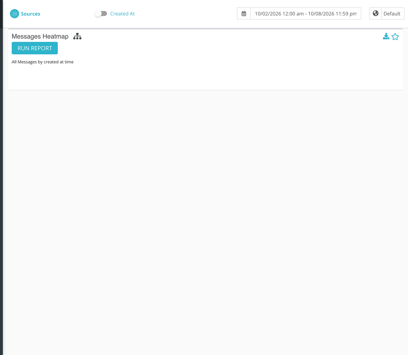
- Pick a date range at the top of the page. Seven days gives a clear weekly pattern; a few weeks gives a steadier one.
- Click Sources and tick the conversation sources you want included. A source here is a channel your ministry has connected, such as a website chat, a text number or a social page. Choose a source group to select several at once.
- Click Run Report.
What each cell counts
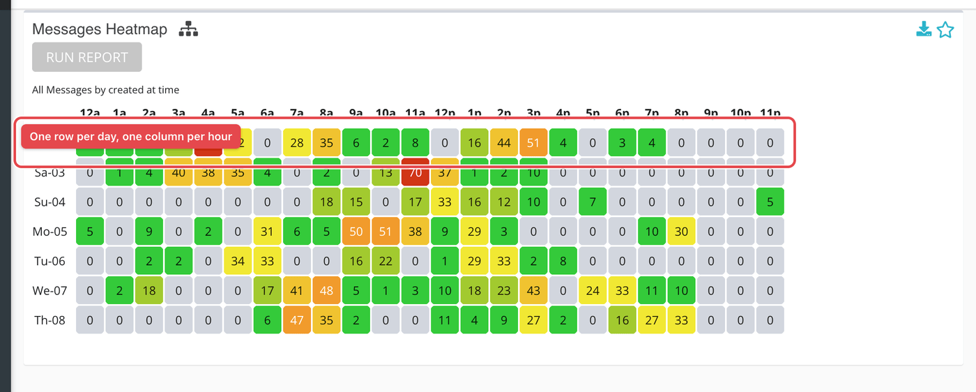
Each message saved in a conversation on one of your selected sources is counted once, in the hour the message was created. It does not matter who wrote it: messages from seekers and messages from your responders both count.
Messages are counted by when they were sent, not by when their conversation started. A conversation that begins on Monday night and runs into Tuesday spreads its messages across both days. Phone calls are not messages and are not part of this report.
The Created At / Closed At switch in the header does not change this report.
Reading the grid
The report is one table. Each row is one day in your date range, labeled with the first two letters of the weekday and the day of the month, such as Mo-05. Each column is one hour of the day, from 12a to 11p. Hours are counted in the time zone chosen next to the date range, which starts as your ministry's time zone.
Each cell is a count. Cells are shaded from pale to deep blue-green in steps, and the shading is relative: the busiest cell on the screen gets the deepest color, and an hour with a count of zero is left unshaded. Two reports side by side will not use the same scale, so read the numbers, not just the color.
| Control | What it does |
|---|---|
| Run Report | Builds the grid for the date range, time zone and sources currently selected. After you run it the button stays grayed out until you change one of them. |
| Average (the small network icon, with the tooltip Average) | Collapses the grid to one row per weekday. Each cell becomes the average for that weekday and hour across the days in your range, rounded down to a whole number. Click it, then run the report again. |
| Download (the arrow icon) | Downloads the same data as a file, in your account's download format. |
| Star | Pins this report as a card you can come back to quickly. |

What the measurements mean
| Term | What it means |
|---|---|
| Message | One entry in a conversation's thread, sent by a seeker or by a responder. |
| Created time | The moment Echo saved the message. |
| Source | A channel your ministry connected. Only messages in conversations on the sources you select are counted. |
When to use it instead of Inbound
Two ministries can have the same number of new conversations and very different workloads. Use Inbound Conversations to see when people arrive. Use this report to see when your responders are doing the most typing and reading. The hours that are tall here and pale there are where conversations are long and ongoing.