Channel Effectiveness answers a question every ministry eventually asks about its advertising and its channels: not which one brings the most conversations, but which one brings the conversations that go somewhere.
The question the report itself names is: Which channels and sources bring conversations that actually go somewhere?
Running it
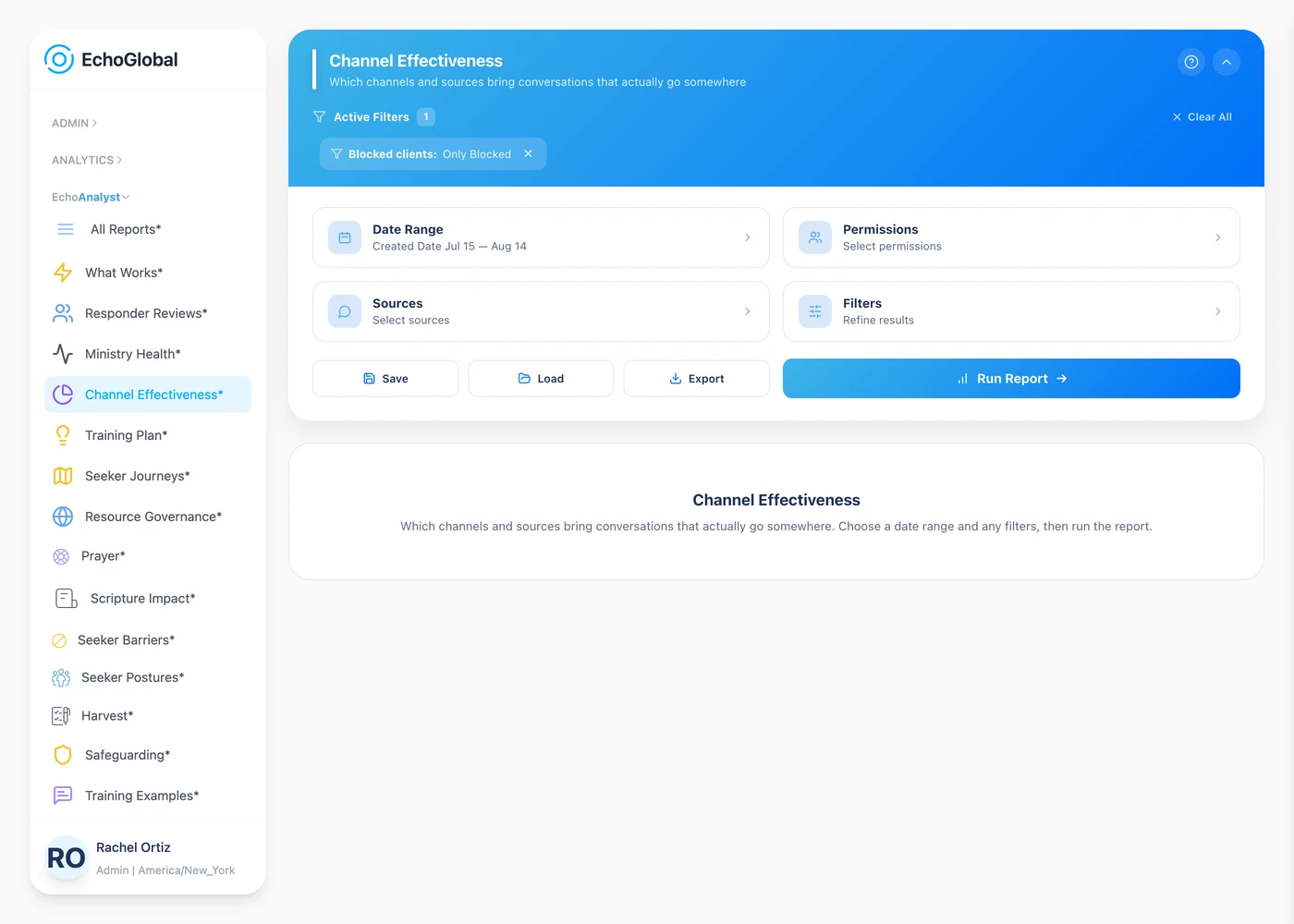
Open EchoAnalyst in the left-hand menu, then Channel Effectiveness. Set a date range, choose your sources if you want to narrow it, and select Run Report. Nothing is computed until you do.
The controls are the same on every Echo Analyst report. They are described once in Getting started with Echo Analyst.
What the page shows
Three tables: Effectiveness by channel, by source and by campaign. All three carry volume, conversation quality and spiritual movement. The channel table adds how often prayer was offered, how fast the first reply went out, and how many seekers came back; the source and campaign tables add professions and missed chats.
Channel is the kind of place a conversation arrived from. Source is the individual referrer inside it. Campaign groups by the campaign tag on the link a seeker followed.
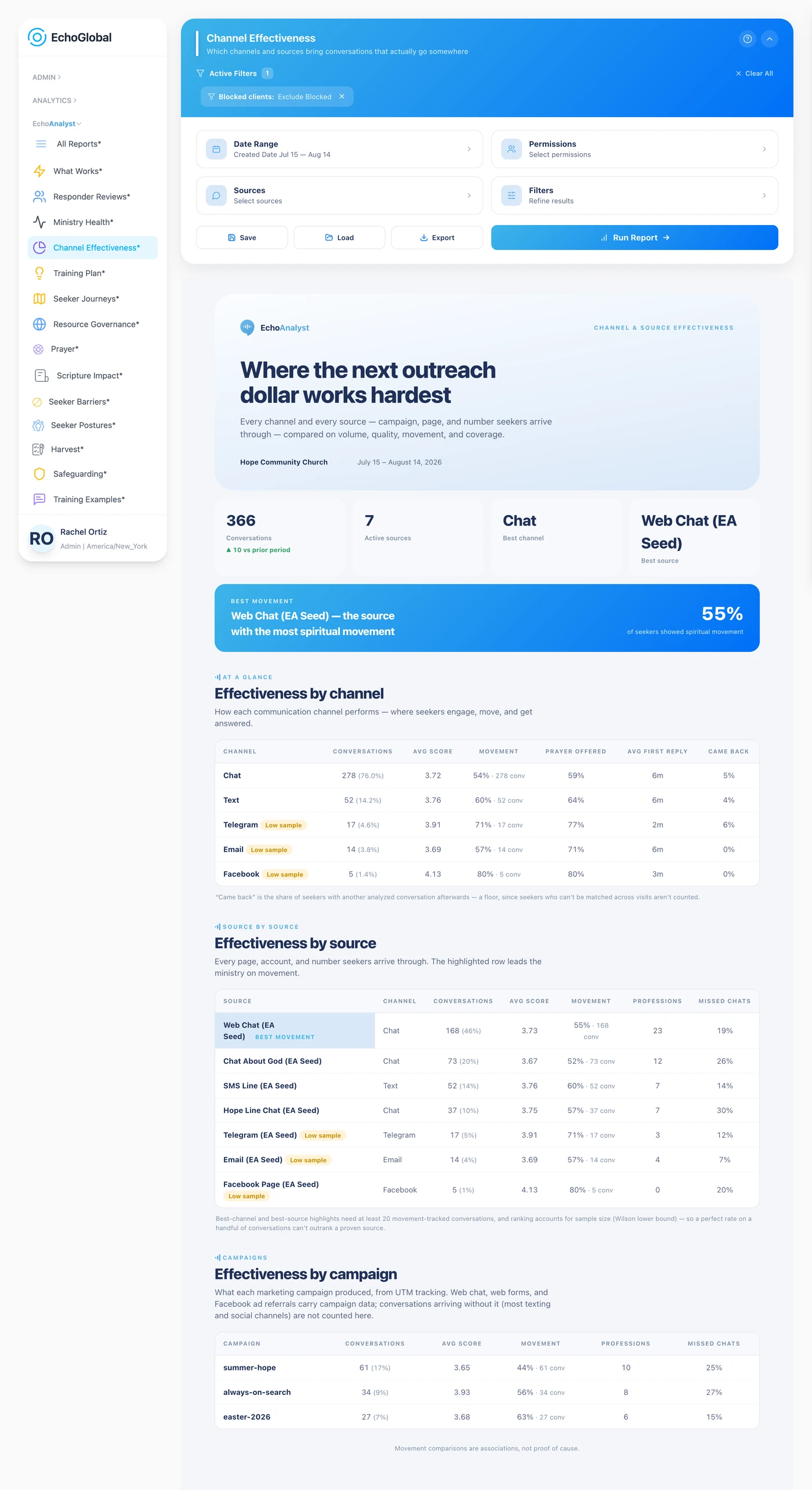
The report itself opens with a Definitions section carrying the same terms in short form, so you can check a word without leaving the page.
What the measurements mean
A measure means the same thing in every table it appears in, so the three tables can be read the same way.
The columns
| Measure | What it is | How it is worked out |
|---|---|---|
| Conversations | Volume in the period. | Analyzed conversations attributed to that channel, source or campaign. |
| Avg score | Overall conversation quality. | The mean of the whole-conversation scores, on the 1–5 scale below. |
| Movement | How often seekers moved toward God. | Share of assessed conversations in the top two movement buckets. |
| Professions | Seekers who prayed to receive Christ. | Conversations whose decision is a salvation prayer. |
| Prayer offered | How often prayer was offered. | Share of conversations where prayer was offered. |
| Came back | Seekers who came back. | The same seeker had another analyzed conversation later. A floor. See below. |
| Avg first reply | How fast the first reply went out. | Average seconds to the first reply. Fast means inside five minutes. |
| Missed chats | Chats where the seeker never replied. | Share of conversations where the seeker sent nothing after the responder’s first reply. Analyses from before this was measured are left out. |
The 1–5 scale
Every skill score in Echo Analyst uses the same five points, and the wording matters. This is not a school grade where 5 is the target.
| Score | What it means | How often |
|---|---|---|
| 1 | Harmful, real harm or a protocol violation, such as missing a crisis or a doctrinal error | Rare |
| 2 | Below standard, a coachable weakness | Uncommon |
| 3 | Met the minimum, acceptable, with clear room to grow | Less common |
| 4 | Doing a good job, the expected baseline for someone doing the work well | Most common |
| 5 | Exceptional, training-example quality, and it requires specific cited evidence | Rare |
4 is the target, not 5. A team averaging 4 is doing the job well. A 5 has to be earned with evidence, so a page full of 5s would be a scoring fault rather than a triumph.
Two rules change how the number comes out. A 1 in any single skill caps the whole conversation's overall score, real harm is not averaged away by nine good things. And three skills return nothing at all when they do not apply: crisis sensitivity when there was no crisis, grace-filled truth when no hard truth was needed, and minors handling when no minor was involved. A blank is "not applicable", never zero.
Spiritual movement
The measure that appears on more Echo Analyst pages than any other. Each analyzed conversation is placed in one of five buckets:
- Significant movement toward God
- Slight movement toward
- No change
- Slight movement away
- Significant movement away
Where a report shows a single movement percentage, it is the share of conversations in the top two buckets, significant plus slight movement toward. "No change" is not counted as positive.
The denominator is conversations where movement was actually assessed, not every conversation in the group. A conversation nobody could read either way is left out rather than counted as no change, so the rate is not quietly deflated by conversations that were never a fair test.
Why the best channel is not the highest percentage
To be eligible for the "best" highlight a channel needs at least 20 conversations with movement tracked. Eligible rows are then ranked by the lower bound of a 95% confidence interval rather than the raw rate, in plain terms, by the rate you can be confident is really there given how many conversations it rests on.
The effect is deliberate: a perfect result over eight conversations cannot outrank a strong result over three hundred. The row you would have picked by eye is very often the one with the smallest sample.
"Came back" is a floor, not a true rate. Seekers your matching limits never reunited count as not returned, so the real figure is likely higher.
How the percentages are worked out
Three habits run through every number on this page, and they explain most of the surprises.
- Rates are per measured conversation, not per conversation. Each measure counts only the conversations where that thing was assessed.
- An empty sample gives a blank, not a zero. Where you see "—", nothing was measured. A confident 0% over no conversations would be a false statement, so the report declines to make it.
- Percentages are never averaged together. When groups are combined, the underlying counts are added and the rate is recomputed. Otherwise a rare group of three conversations would weigh as heavily as a common one of three hundred.
Why comparisons are not proof
Everything that compares one group against another here is an association. The report says so in its own words, and it is not a disclaimer to skip: if your team tends to do something in the conversations that were already going well, that practice will appear to cause the result.
The honest way to use it: treat a gap as a reason to try something deliberately, then watch whether the numbers follow.
Reading it honestly
Everything comparing one group against another on this page is an association, not proof of cause. The report says so in its own words, and it matters: if your team tends to do something in the conversations that were already going well, it will look like that practice caused the result.
The "best" highlight is not simply the highest rate. A channel needs at least 20 conversations with movement tracked to be eligible at all, and eligible rows are ranked by a statistical lower bound rather than the raw percentage, so a perfect result over a handful of conversations cannot outrank a strong result over hundreds. This is deliberate. The row you would have picked by eye is often the one with the smallest sample.
If it comes back empty
Two things cause this, and neither means the report is broken.
The Sources filter remembers what you last chose. A selection made months ago can exclude everything you have added since. Open Sources, check what is ticked, and run it again.
Only closed conversations are analyzed. A conversation that is still open, or that was abandoned before your team replied, carries no analysis and appears in no number here. A busy period can still be a thin one for this report if most of it never closed.